Look-shadcn
Shadcn styling on SDK controls.
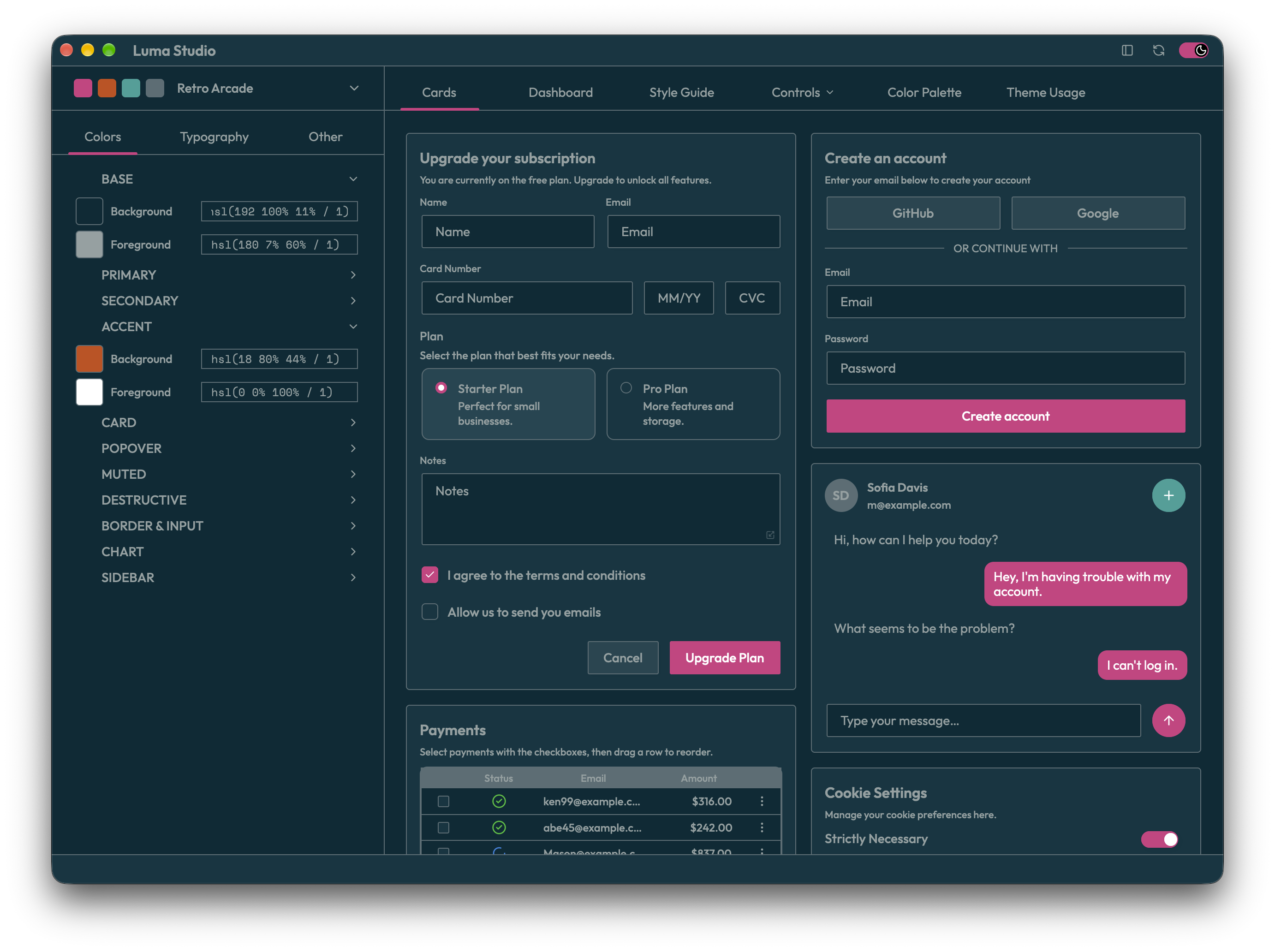
Use it
use gpui::{Context, Entity};
use xgpui_luma::controls::button::Button;
use xgpui_luma::infra::presenter::HasPresenter;
use xgpui_luma_look_shadcn as shadcn;

struct Example { save_requests: usize }

fn save_button(cx: &mut Context<Example>) -> Entity<Button> {
    shadcn::Button::new("save").primary().label("Save")
        .on_click(cx, |app, cx| {
            app.save_requests += 1;
            cx.notify();
        })
        .spawn(cx)
}
Inside an initialized view constructor. Store and render the returned entity.
Control support
Support describes the styling this Look supplies for the documented SDK controls. SDK behavior and events are shared across Looks.
Supported: a Look builder, theme, or template is available; the notes identify how to use it. Partial: styling is available only through another control. Not provided: no styling adapter is supplied. Styling not needed: use the SDK utility directly; its child controls or scrollbar may still need styling.
| Control | Support | Notes |
|---|---|---|
| Accordion | Supported | Accordion builder. |
| Autocomplete | Supported | Autocomplete builder. |
| Button | Supported | Button builder. Primary, Secondary, Outline, Ghost, ContentOnly. |
| Checkbox | Supported | Checkbox builder. |
| ComboBox | Supported | ComboBox builder. |
| Context Menu | Supported | ContextMenu builder. |
| Control Group | Supported | control_group_template(). Group templates and theme are available on ShadcnLook. |
| Dock Splitter | Supported | dock_splitter_theme(). Pass the theme to the SDK builder. |
| Floating Menu | Supported | floating_menu_theme(). Pass the theme to the SDK menu. |
| Frame | Styling not needed | Use SDK Frame for layout and optional decoration; no Look is required. Optional Shadcn Frame and Frame::sidebar presets supply panel colors. |
| Icon Button | Supported | Use Button with the SDK icon role; shares button styling. |
| Icon Group | Supported | IconGroup builder. |
| List Box | Supported | ListBoxBuilder builder. |
| Overlay Window | Supported | overlay_window(). ShadcnLook returns a themed SDK builder. |
| Pager | Supported | Pager builder. |
| Popover Button | Styling not needed | Supply the trigger and popup content; style those controls with the chosen Look. |
| Popup Menu | Supported | PopupMenu builder. |
| Popup Scroll Surface | Styling not needed | Popup scrolling needs no Look styling; visible scrollbar chrome uses the supplied ScrollbarTemplate. ShadcnLook supplies scrollbar_template(). |
| Progress | Supported | Progress builder. |
| Radio Button | Supported | Radio builder. |
| Radio Group | Supported | RadioGroup builder. |
| Resizable Panels | Supported | resizable_panels(). ShadcnLook returns a themed SDK builder. |
| Scroll Container | Styling not needed | Scrolling needs no Look styling; visible scrollbar chrome uses the supplied ScrollbarTemplate. ShadcnLook supplies scrollbar_template(). |
| Scrollbar | Supported | Scrollbar builder. |
| Search Selector | Supported | SearchSelector builder. |
| Selection Panel | Supported | SelectionPanel builder. |
| Selector | Supported | Selector builder. |
| Selector List | Supported | selector_items_panel_look(). Shared row styling used by selector-family controls; no standalone control. |
| Sidebar | Supported | Sidebar builder. |
| Slide Panel | Supported | slide_panel_background(). Also provides slide_panel_panels_look(); compose the SDK panel. |
| Slider | Supported | Slider builder. |
| Split Button | Supported | Dedicated SDK SplitButton entity, template/theme factories, and independent primary disabling. |
| Split View | Supported | split_view(). ShadcnLook returns a themed SDK builder. |
| Stepper | Supported | Stepper builder. |
| Switch | Supported | Switch builder. |
| Table | Supported | Table builder. |
| Tabs | Supported | Tabs builder. |
| Text Area | Supported | TextArea builder. |
| Text Field | Supported | TextField builder. |
| Toggle | Supported | Toggle builder. |
| Toolbar | Supported | Toolbar builder. |
| Tooltip | Supported | tooltip_theme(). Theme helper; Look builders attach it to supported controls. |
| Tree View | Supported | TreeView builder. |
Variants and customization options belong to each Look. Names in different Looks do not guarantee matching appearances. See the Look public API for exports.
Look selection
Builders use the application’s global ShadcnLook, or the built-in fallback. No .look(...) call is required.
Use .look(&custom_look) only to bind a particular instance, such as a fork or preview.
Customize
Shadcn’s Rust stylesheet constructor inherits the SDK baseline and supplies its color, metric, and elevation rules. Clone stylesheet::embedded_stylesheet() to customize the complete configuration. CSS catalogs continue to supply Shadcn theme tokens. For external TOML input, parse configuration with StylesheetConfig::parse and pass it to ShadcnLook::from_css_str_with_stylesheet. Common palette/geometry settings and look-owned CSS rules are distinct inputs. See shared stylesheet contract.
Start with builder variants. Use content presenters and template modifiers for local changes; use a template override for a different structure.
Load Shadcn themes
Use ShadcnLook::built_in() for the bundled fallback. Load custom palette tokens from CSS strings with ShadcnLook::from_css_str; the bundled CSS is also exported as xgpui_luma_look_shadcn::FALLBACK_CSS. The parser accepts tweakcn-style :root and .dark custom properties.
For a custom stylesheet, parse TOML with StylesheetConfig::parse, then pass it with the CSS string to ShadcnLook::from_css_str_with_stylesheet. Applications own file loading and any required path or input-size restrictions; the string parsers impose no size limits. The former from_css_path and from_css_path_with_stylesheet helpers have been removed.
Enable the look crate’s inspect feature for developer inspection tools. Luma Studio includes theme inspection examples; run it with just app-studio from the repository root, or just --set profile dev app-studio for a debug build.
Drag/drop
ListBox, Table, TreeView, Sidebar, Tabs and Accordion expose their SDK drag/drop configuration and named callbacks through Shadcn adapters. Render a persistent ListBox with ListBoxBuilder::from_control or ShadcnLook::render_listbox. See Drag and drop for the shared contract and coverage; ListBox, TreeView Table, Sidebar and Tabs and Accordion contain setup and examples.