Look-radix
Radix styling and palette scales on SDK controls.
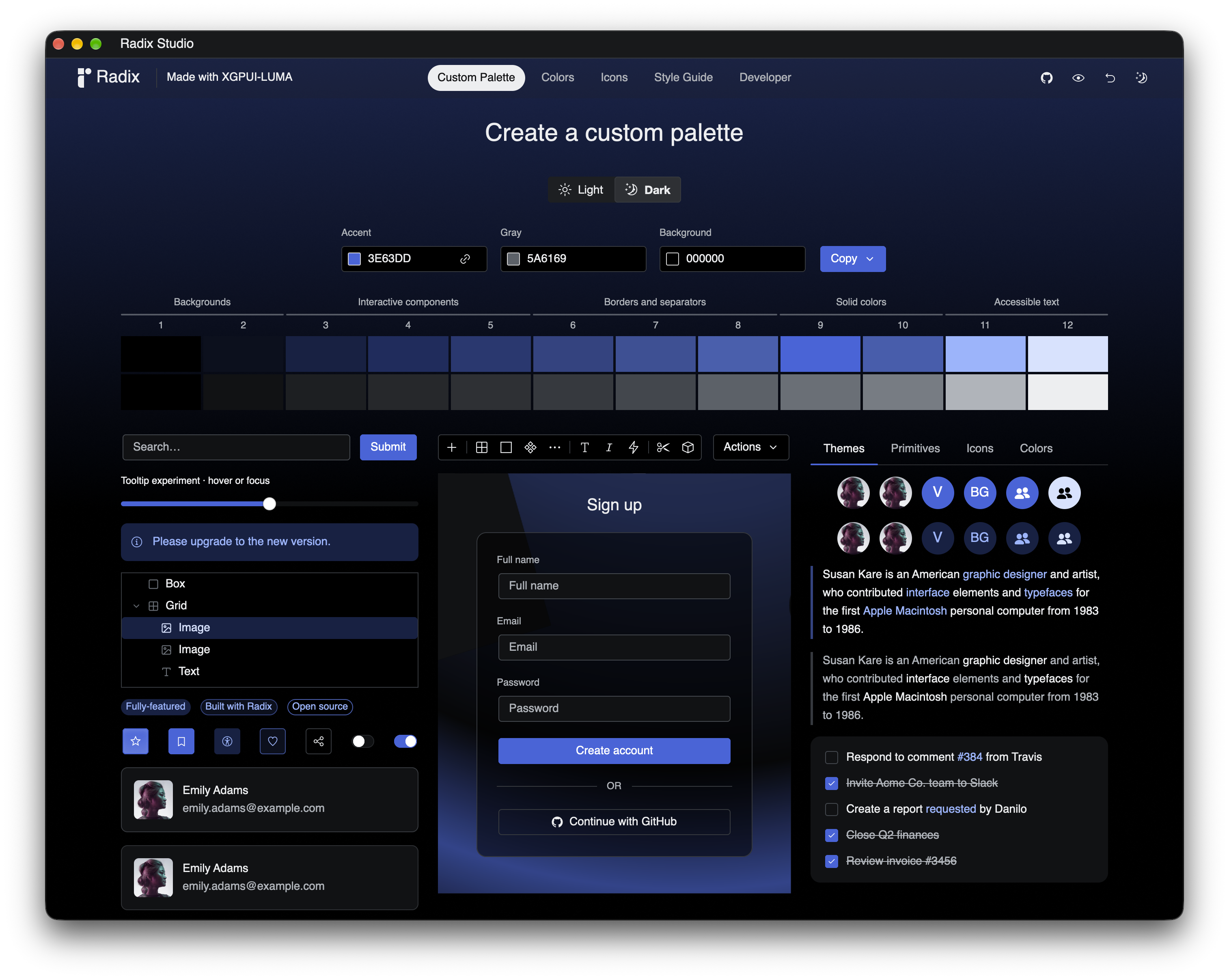
Use it
use gpui::{Context, Entity};
use xgpui_luma::controls::button::Button;
use xgpui_luma::infra::presenter::HasPresenter;
use xgpui_luma_look_radix as radix;

struct Example { save_requests: usize }

fn save_button(cx: &mut Context<Example>) -> Entity<Button> {
    radix::Button::new("save").solid().label("Save")
        .on_click(cx, |app, cx| {
            app.save_requests += 1;
            cx.notify();
        })
        .spawn(cx)
}
Call inside an initialized application. Callbacks use the same SDK events in both Looks. This example is compilation-checked.
Control support
All documented SDK control families now have Radix styling or an explicit styling-independent utility classification. The table lists the exported builder, theme, or composition helper for each control. SDK behavior, focus, accessibility, and events remain shared across Looks.
Supported: a Look builder, theme, or template is available; the notes identify how to use it. Partial: styling is available only through another control. Not provided: no styling adapter is supplied. Styling not needed: use the SDK utility directly; its child controls or scrollbar may still need styling.
| Control | Support | Notes |
|---|---|---|
| Accordion | Supported | accordion_builder() and exported theme/template helpers; SDK behavior and customization APIs remain available. |
| Autocomplete | Supported | autocomplete_builder(); SDK callbacks, interaction policies, and template customization remain available. |
| Button | Supported | Button builder. Solid, Soft, Surface, Outline, Ghost, Classic; specialized variants also available. |
| Checkbox | Supported | Checkbox builder. Classic, Surface, Soft. |
| ComboBox | Supported | combobox_builder(); SDK callbacks, interaction policies, and template customization remain available. |
| Context Menu | Supported | ContextMenu builder. |
| Control Group | Supported | Shared base styling for derived groups via control_group_builder() and theme/template helpers; no standalone Style Guide section. |
| Dock Splitter | Supported | dock_splitter_builder, live theme, and optional grip template retain SDK pointer/keyboard resizing and callbacks. |
| Floating Menu | Supported | floating_menu_look() supplies shared panel, row, and separator styling to the SDK renderer; no separate entity or builder. |
| Frame | Styling not needed | Use SDK Frame for layout and optional decoration; no Look is required. |
| Icon Button | Supported | Use Button with the SDK icon role; shares button styling. |
| Icon Group | Supported | icon_group_builder() and exported theme/template helpers; SDK behavior and customization APIs remain available. |
| List Box | Supported | ListBoxBuilder builder. |
| Overlay Window | Supported | LookControlExt::overlay_window() returns a themed SDK builder. |
| Pager | Supported | pager_builder() and exported theme/template helpers; SDK behavior and customization APIs remain available. |
| Popover Button | Styling not needed | Supply the trigger and popup content; style those controls with the chosen Look. |
| Popup Menu | Supported | PopupMenu builder. Solid, Soft. |
| Popup Scroll Surface | Styling not needed | Popup scrolling needs no Look styling; visible scrollbar chrome uses the supplied ScrollbarTemplate. Supply Radix scrollbar_template(&look). |
| Progress | Supported | Progress builder. Surface, Soft. |
| Radio Button | Supported | Radio builder. Classic, Surface, Soft. |
| Radio Group | Supported | RadioGroup builder. |
| Resizable Panels | Supported | resizable_panels_builder, live frame/divider/grip theme, and SDK template retain resize, constraints, regions, collapse, and callbacks. |
| Scroll Container | Styling not needed | Scrolling needs no Look styling; visible scrollbar chrome uses the supplied ScrollbarTemplate. Supply Radix scrollbar_template(&look). |
| Scrollbar | Supported | scrollbar_theme() / scrollbar_template(); SDK callbacks, interaction policies, and template customization remain available. |
| Search Selector | Supported | search_selector_builder(); SDK callbacks, interaction policies, and template customization remain available. |
| Selection Panel | Supported | selection_panel_builder(); SDK callbacks, interaction policies, and template customization remain available. |
| Selector | Supported | Selector builder. |
| Selector List | Supported | selector_items_panel_look() supplies row/panel styling for the SDK selector-items template; shared by Radix Selector. |
| Sidebar | Supported | sidebar_builder() and exported theme/template helpers; SDK behavior and customization APIs remain available. |
| Slide Panel | Supported | slide_panel_state captures Look geometry/motion; overlay, inset, and local surface render helpers use live Radix colors with app-owned SDK state and handlers. |
| Slider | Supported | Slider builder. Classic, Surface, Soft. |
| Split Button | Supported | split_button_builder with shared Radix trigger/menu theme and SDK template preserves independent faces, primary-only disabling, focus, and semantic callbacks. |
| Split View | Supported | split_view_builder and theme/template factories retain SDK pane constraints, collapse behavior, callbacks, and motion. |
| Stepper | Supported | stepper_builder() and exported theme/template helpers; SDK behavior and customization APIs remain available. |
| Switch | Supported | Switch builder. Classic, Surface, Soft. |
| Table | Supported | table_builder, live shell/row themes and templates, and paging_table_builder preserve SDK selection, columns, and paging. |
| Tabs | Supported | Tabs builder. Line, Surface. |
| Text Area | Supported | TextArea builder. |
| Text Field | Supported | TextField builder. Classic, Surface, Soft. |
| Toggle | Supported | Toggle builder. |
| Toolbar | Supported | Toolbar builder. |
| Tooltip | Supported | tooltip_theme(); builders attach it to supported controls. |
| Tree View | Supported | TreeView builder. |
Coverage audit for #134: the table covers the public SDK control families, including shared renderers and utilities. Every control family needing styling now has a Radix adapter or shared styling helper; see the per-control notes for composition boundaries. Shared Scrollbar styling is available for visible scrolling chrome. Frame, Popover Button, Scroll Container, and Popup Scroll Surface intentionally need no dedicated Look builder. Component metrics and tooltip coverage remain coordinated with #28 and #100.
The shared menu and selector-panel helpers resolve snapshots from the supplied Look using Radix size 2; their _for variants accept SDK sizes and resolve Radix keys 1–3. Resolve again during render and notify affected owners after palette, mode, or stylesheet changes. Selection/search factory functions accept an explicit Look and return SDK builders with Radix text fields, menu/panel chrome, and scrollbars. Configure callbacks, policies, sizes, and template overrides on the returned builder before spawning. Theme colors and theme-owned geometry resolve live; builder-owned affordance geometry, icons, and motion defaults are captured at construction. Scrollbar and SDK affordance geometry use SDK size keys (sm, md, lg); Radix menu/panel and text-field themes use 1–3.
Group/navigation factories also accept an explicit Look and return SDK builders. Group item size is selected when creating the factory; Accordion and Stepper retain SDK size options. Pager supports Minimal, MinimalEdge, and Numeric layouts; Sidebar supports expanded and icon-rail presentations. Derived groups and navigation controls have Style Guide sections with template, palette, and applicable size/layout comparisons without live examples. Themes resolve from the retained Look; notify affected owners after changes.
table_builder and paging_table_builder share SDK table selection, columns, resizing, virtualization, and row-key behavior. dock_splitter_builder, resizable_panels_builder, and split_view_builder preserve SDK resize constraints and callbacks. Slide Panel remains app-owned state: use slide_panel_state and the overlay/inset/surface render helpers for Radix surface and resize chrome.
Split Button is a full SDK control through split_button_builder(&look, id, variant, tone). Solid and Soft select menu-highlight variants and default Primary/Secondary trigger styles; Outline and Ghost are SDK trigger-style choices. Primary-only disabling and action/menu events remain SDK behavior. Static Studio previews cover the visual treatments, independent menu-face feedback, and icon content.
Variants and customization options belong to each Look. Names in different Looks do not guarantee matching appearances. See the Look public API for exports.
SDK builder factories
Pass the same Look to related controls, retain the returned entities in your owning view, and render them through GPUI. A fork remains bound to the supplied controls; changing the ambient global Look does not rebind them.
struct RadixControls {
    search: xgpui_luma::controls::autocomplete::Autocomplete,
    records: gpui::Entity<xgpui_luma::controls::table::TableControl<String>>,
    save: gpui::Entity<xgpui_luma::controls::split_button::SplitButton>,
}

fn radix_controls<M: 'static>(look: &radix::Look, cx: &mut gpui::Context<M>) -> RadixControls {
    let search = radix::autocomplete_builder(look, "search", [
        xgpui_luma::controls::autocomplete::SelectionItem::new("rust", "Rust"),
    ]).spawn(cx);
    let records = radix::table_builder(look, "records")
        .items(["Draft".to_string(), "Published".to_string()])
        .row_label(|row: &String| row.clone())
        .extended().visible_rows(4).spawn(cx);
    let save = radix::split_button_builder(
        look, "save", radix::PopupMenuVariant::Solid, radix::Tone::Accent,
    ).label("Save").items([
        xgpui_luma::infra::menu_item::MenuItem::new("save-as").label("Save as"),
    ]).spawn(cx);
    RadixControls { search, records, save }
}
Compilation-checked integration example. See each control’s page for SDK callbacks and customization. After editing a bound Look, notify the affected control entities and their owners. Snapshot helpers such as floating_menu_look and selection_panel_look must be resolved again during render.
Look selection
Look-owned types such as Button and PopupMenu use the application’s global Look, or the built-in fallback; bind a fork with .look(&custom_look). Factory functions such as autocomplete_builder, table_builder, and split_button_builder instead require an explicit &Look argument. They return SDK builders, so configure callbacks, policies, sizes, and template overrides before .spawn(cx).
Customize
Radix’s Rust stylesheet constructor inherits the SDK baseline. Geometry, icons, state recipes, and motion use the shared schema. Ordered button rules and Classic tuning are authored in src/button_recipes.rs. Use Look::set_common_stylesheet for a resolved common sheet and Look::set_button_recipes for external sparse rule overrides; a supplied rules array replaces the list. Notify affected views after shared edits. See shared stylesheet contract.
Use the supported variants, sizes, tones, and radii. Use local template modifiers where available. Inspect the Look’s ownership and redraw rules when changing shared settings.
Custom Tabs content transitions
The Radix Tabs builder forwards the public SDK .content_transition(...) and .content_layout(...) APIs. Radix supplies navigation styling and inherited motion defaults; the app supplies its content renderer. Set timing through .motion(|m| m.content = ...) rather than implementing an animation clock in the look.
Use TabsContentTransition::with_factory for independent per-control state and continuous retargeting, and select TabsContentLayout::Fill explicitly for a bounded sliding viewport. Radix Studio uses an app-owned directional slide with a local 400 ms override, per-screen backgrounds and scroll handles, and independently updated navigation chrome. These choices do not change the look's default behavior.
See Tabs content transitions for the SDK lifecycle, focus targets, layout policies and a compilation-checked example; Motion explains the separation between timing and presentation.
Drag/drop
ListBox, TreeView and Tabs expose their SDK drag/drop configuration and named callbacks through Radix adapters. ListBoxBuilder::new consumes the persistent SDK control. table_builder retains SDK row keys, selection, column resizing, and row reordering APIs. Enable Tabs .reordering(true) for same-strip moves. See Drag and drop for the shared contract and coverage; ListBox, TreeView contain setup and examples.